
Summary:
Using Low-Resolution Images That Look Pixelated
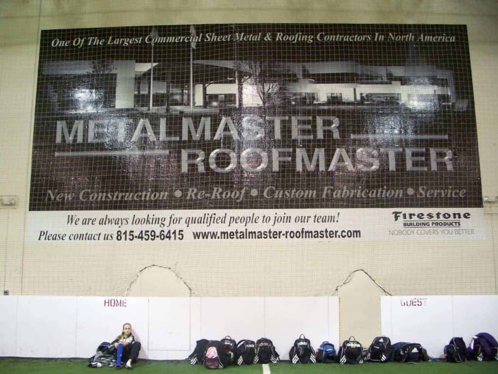
This is the most common banner mistake, and it’s a dead giveaway that screams “amateur.” You design something that looks perfect on your computer screen, send it to the printer, and get back a blurry mess.
Here’s what happens: images that work fine for websites are usually 72 DPI (dots per inch). But custom banners need 150-300 DPI at their final printed size to look sharp. When you stretch a low-resolution image to banner size, every pixel becomes visible, creating that fuzzy, unprofessional look that makes people question your attention to detail.
Why Screen Resolution Doesn't Work for Print
Your computer monitor displays images differently than a printer reproduces them. Screens use RGB color and pixels, while printers use CMYK color and dots. What looks crisp on your screen can turn into a pixelated disaster when printed large format.
Think about it this way: if you have a 500-pixel-wide logo that looks great on your website, printing it at 6 feet wide means each pixel becomes visible to the naked eye. That’s like taking a postage stamp photo and blowing it up to poster size—you’re going to see every imperfection.
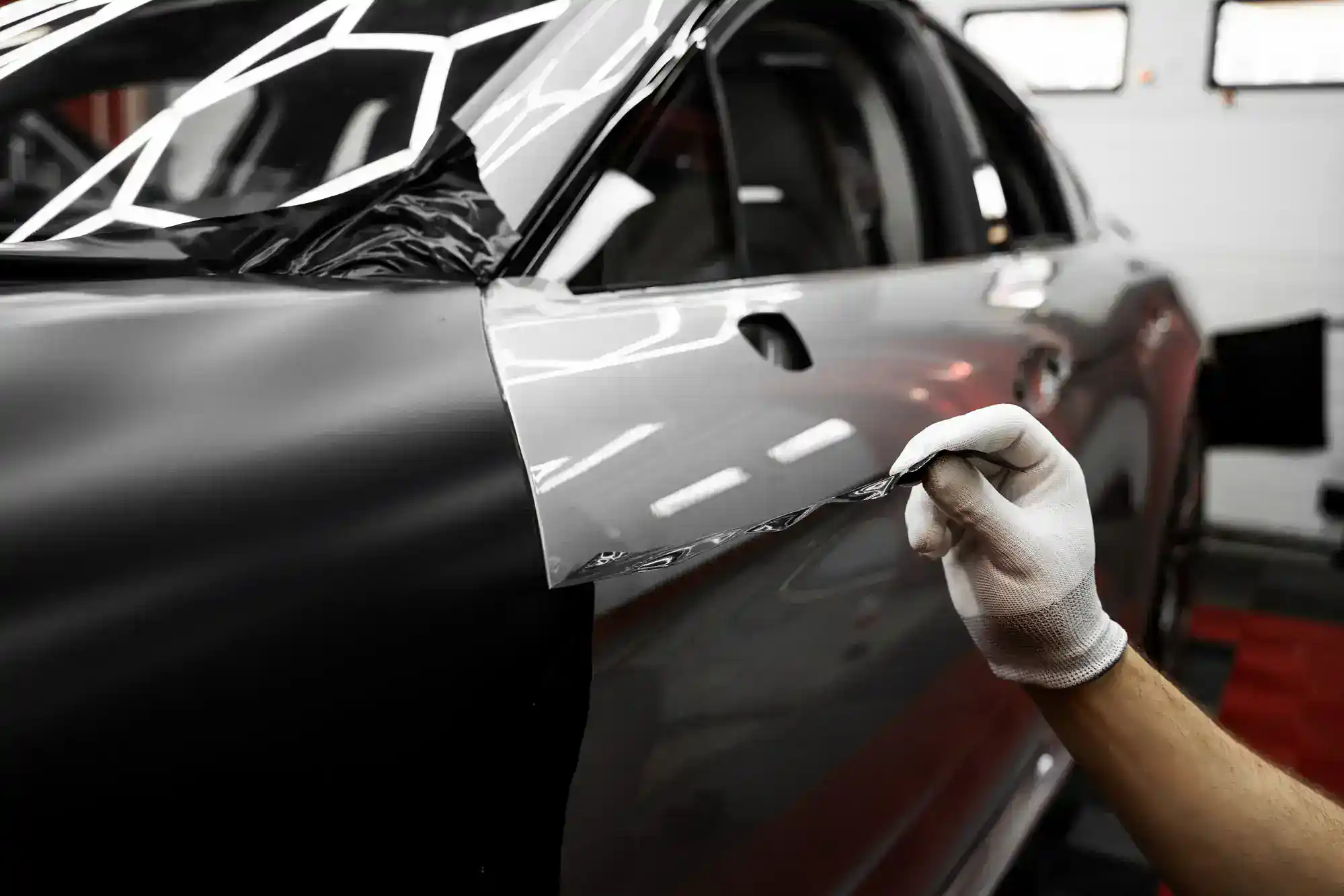
The solution isn’t complicated, but it requires planning ahead. Always source high-resolution versions of your logos, photos, and graphics before starting your banner design. Vector graphics work even better because they scale to any size without losing quality. If you only have low-resolution images, either get better versions or redesign around graphics you can actually use.
Professional banner companies know this, which is why we often catch resolution problems before printing. But not every printer checks, and by then you’ve already paid for design time and materials. Save yourself the headache and the expense by starting with the right image quality from day one.
How to Get High-Quality Images for Your Banner
Getting the right image quality doesn’t have to be complicated, but it does require knowing where to look and what to ask for. Start with your original logo files—the ones your designer gave you when your logo was created. These should include vector formats like AI, EPS, or high-resolution PNG files.
For photos, aim for at least 300 DPI at the size you plan to use them. If your banner will be 4 feet wide and your photo takes up half of it, you need a photo that’s 300 DPI at 2 feet wide. That’s roughly 7,200 pixels wide—much larger than most photos you’d use on a website.
Stock photo sites like Shutterstock or Getty Images offer high-resolution downloads specifically for print use. When you’re searching, look for the largest available size and check the dimensions before purchasing. Many sites will show you exactly what print sizes each image resolution supports.
If you’re working with a photographer, specify that you need print-resolution files. Most professional photographers shoot in RAW format, which gives them flexibility to export high-resolution versions later. Don’t accept web-optimized JPEGs for banner use—they’re compressed specifically to load quickly online, which means they’ve sacrificed print quality.
When in doubt, bigger is better. You can always make a high-resolution image smaller, but you can’t add detail to a low-resolution image after the fact. We can also advise you on image requirements during the design process, potentially saving you from expensive reprints.
Cramming Too Much Information on One Banner
Many Long Lake businesses try to fit their entire company story, service list, and contact information on a single banner. The result? A cluttered mess that no one can read or understand at a glance.
Remember, people driving by your banner have maybe 3-5 seconds to absorb your message. If they have to work to figure out what you’re selling or why they should care, they won’t. Your banner should communicate one clear message that’s immediately obvious from a reasonable distance.
The 3-Second Rule for Banner Design
We follow what’s called the “3-second rule”—your banner should communicate its main message within three seconds of someone seeing it. This isn’t arbitrary; it’s based on how people actually interact with outdoor advertising and promotional materials.
Think about your own behavior when you’re driving through Long Lake or walking through a business district. You’re not stopping to study every sign you see. You’re glancing, processing what catches your eye, and moving on. If a banner requires more than a quick glance to understand, it fails its basic purpose.
The most effective banners focus on a single, compelling message. Instead of “Joe’s Plumbing – Residential and Commercial Services – Drain Cleaning, Water Heater Repair, Pipe Installation, Emergency Service Available 24/7 – Licensed and Insured,” try “Emergency Plumbing Repair.” The second version communicates the most important information immediately.
This doesn’t mean your banner can’t include multiple pieces of information. It means you need to prioritize them visually. Your main message should be the largest and most prominent element. Secondary information should be clearly visible but not competing for attention. Everything else—your address, website, list of services—can be smaller or eliminated entirely.
Consider your banner’s viewing environment too. A banner hanging inside a trade show booth can include more detail because people will be standing close and have time to read. A roadside banner needs to work for people driving by at 35 mph. Match your information density to your audience’s attention span and viewing conditions.
Creating Visual Hierarchy That Actually Works
Visual hierarchy isn’t design jargon—it’s the roadmap that guides someone’s eyes through your banner in the right order. Without it, even simple banners become confusing because viewers don’t know what to look at first.
Start with your most important element, which is usually your main message or value proposition. This should be the largest text on your banner and positioned where eyes naturally go first (typically the upper left or center). Make it big enough to read from your intended viewing distance. For roadside banners, that might mean 6-inch tall letters or larger.
Your business name comes next in the hierarchy, but it doesn’t always need to be the biggest element. If you’re running a “50% Off Sale” promotion, that message is more important than your company name for driving immediate action. People can learn your name after you’ve caught their interest.
Contact information should be clearly visible but not overwhelming. Make it large enough to read and remember, but not so large that it competes with your main message.
Use color strategically to support your hierarchy. High contrast between text and background improves readability, while color can direct attention to your most important elements. But avoid using too many colors—three or four maximum keeps things clean and professional.
White space isn’t wasted space; it’s breathing room that makes your banner easier to read and more professional looking. Don’t feel like you need to fill every inch of your banner with information. Sometimes the most effective banners are the ones with the most white space around a simple, powerful message.
Getting Your Long Lake Banner Right the First Time
Custom banner mistakes are expensive, but they’re also completely avoidable when you know what to watch for. High-resolution images, focused messaging, and clear visual hierarchy aren’t complex concepts—they’re basic principles that separate professional-looking banners from amateur ones.
The businesses around Long Lake that get the most from their banner investments are the ones that plan ahead, prioritize their message, and work with experienced professionals who understand both design and printing requirements. Your banner represents your business to every potential customer who sees it.
When you’re ready to create custom banners that actually work for your Long Lake business, we bring over 20 years of experience helping companies avoid these costly mistakes and create promotional materials that deliver real results.